PIRAEUS REBRANDING
Founded in 1916 and publicly listed on the Athens Stock Exchange, Piraeus is Greece’s leading banking institution, serving 6 million customers
and employing 7,700 staff members. We collaborated with Mucho for a strategic rebrand following a remarkable recovery that revitalized both
the bank and the country’s economy. As CEO Mr. Megalou noted, “After the recovery of the economy, the sector, and the bank itself, it is now
time to move forward.” This rebrand is his commitment to the future.
SYMBOL OF CHANGE
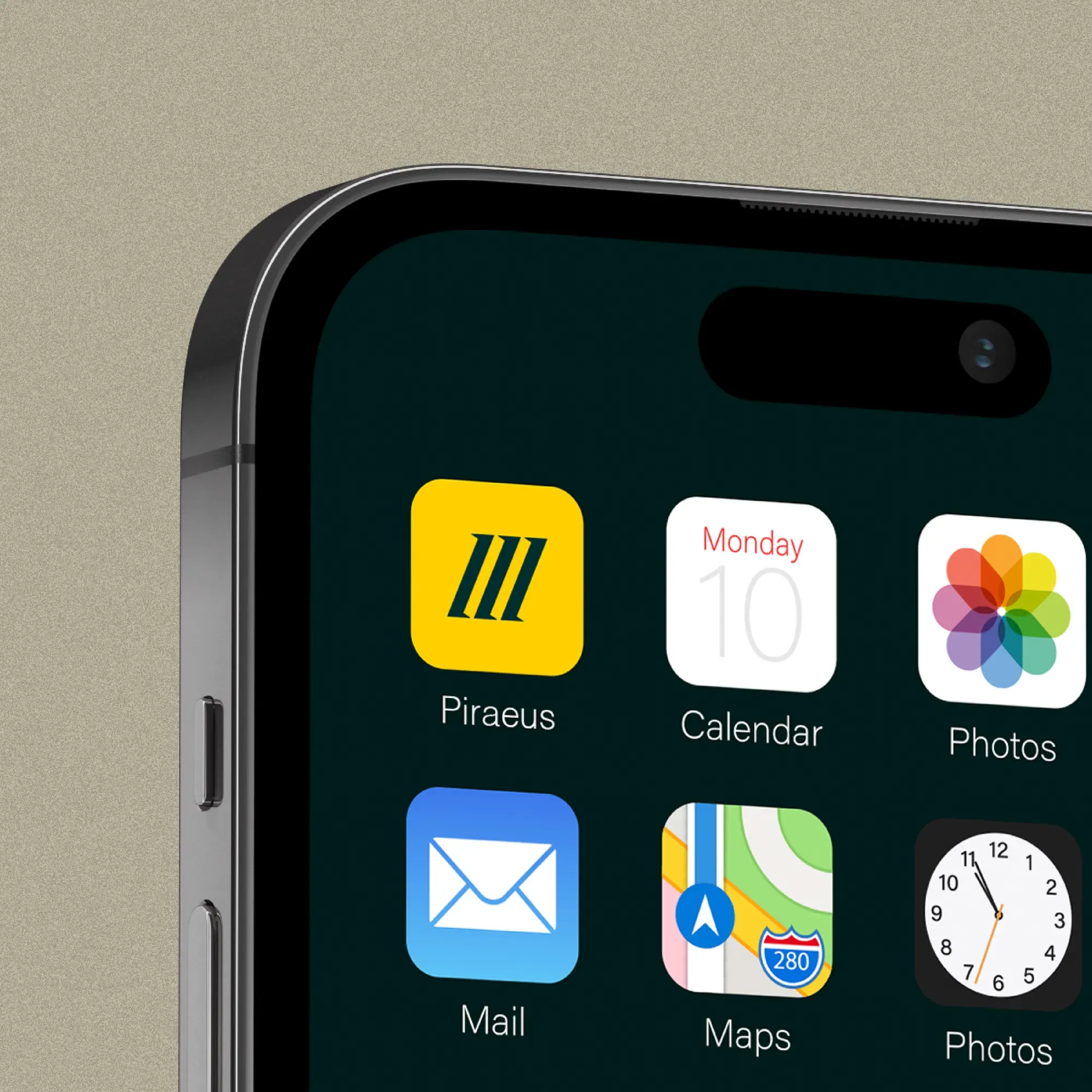
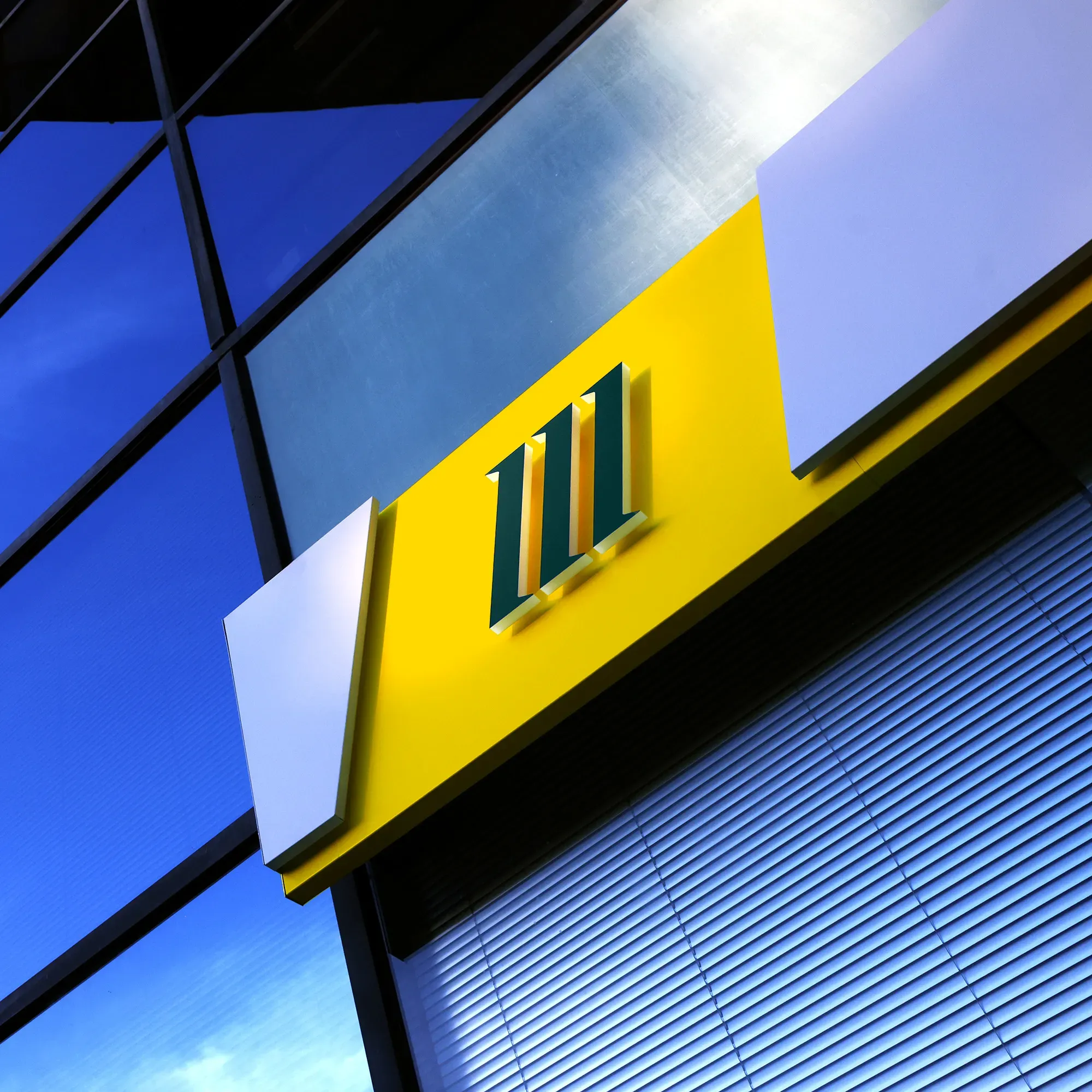
The reimagined symbol in Piraeus’ rebranding transforms the three stripes to honor heritage and embrace a bold future, symbolizing Progress,
Innovation, Reliability, and Openness. The custom logotype enhances visibility and underscores a modern approach.
A VIBRANT PALETTE FOR A FORWARD-THINKING BRAND
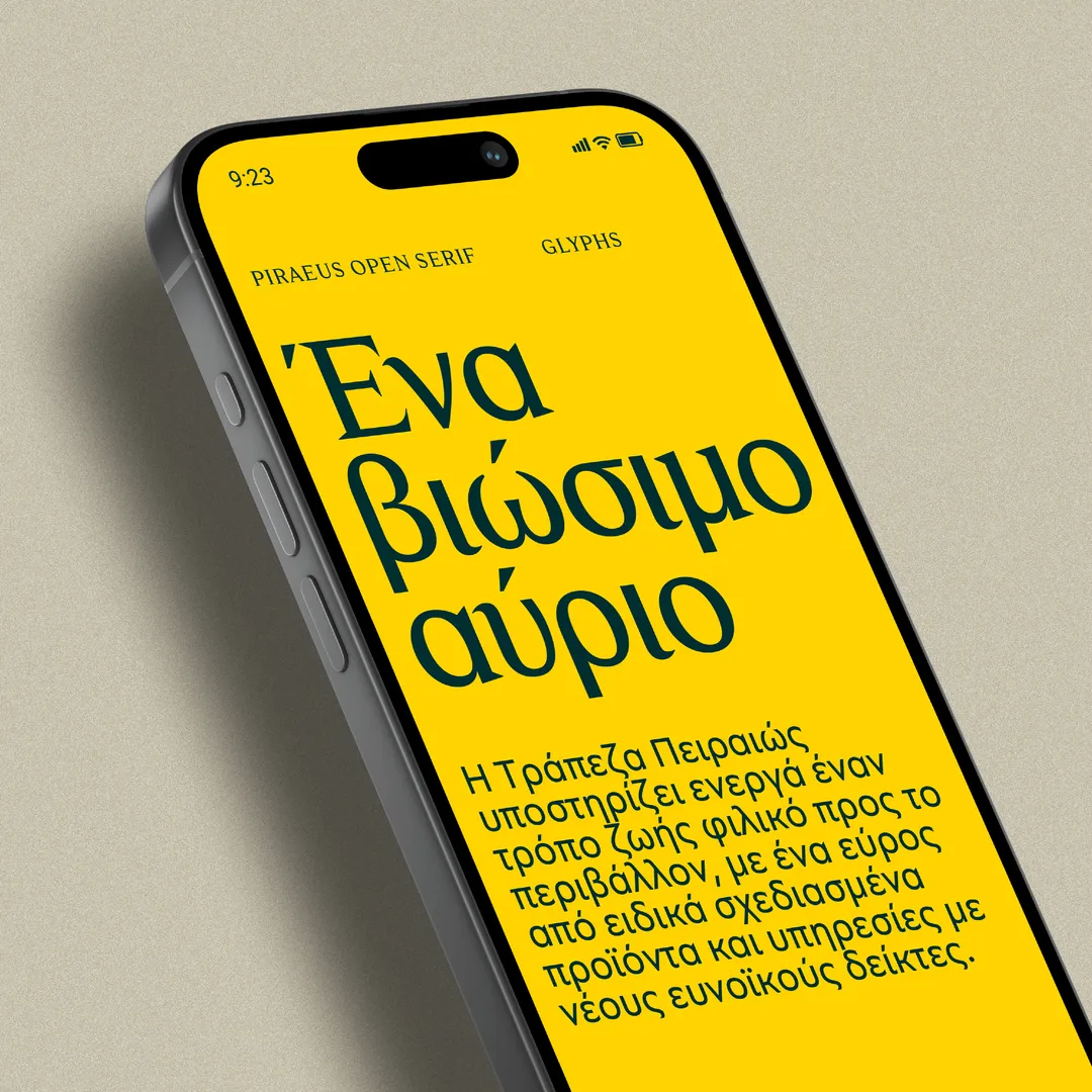
Green is the new Blue in our updated palette, which transitions from Yellow and Corporate Blue to a vibrant combination of Piraeus Yellow, Green, and Grey.
The brighter Piraeus Yellow embodies the bank’s spirit, Green symbolizes sustainability and growth, and Grey provides balance.
This new palette offers flexibility across various platforms, reflecting a forward-thinking mindset.
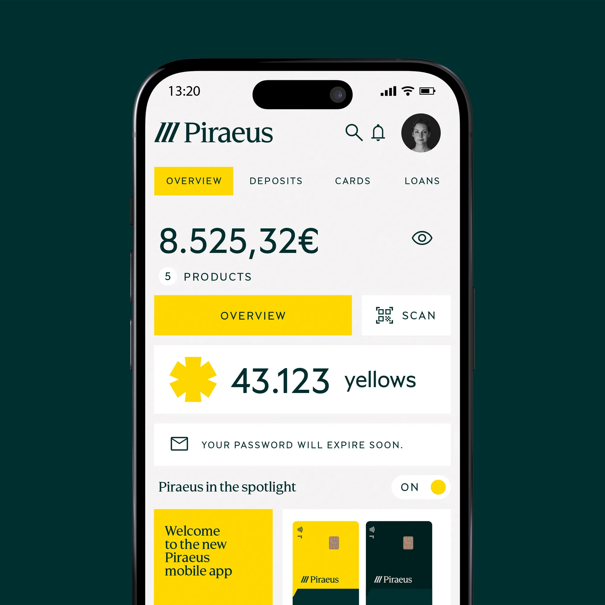
TWO DISTINCT TIERS SHAPE OUR COMMUNICATION STRATEGY
Tier 1 communicates the bank’s core values with the reimagined symbol as a powerful emblem, establishing a strong customer connection.
Tier 2 introduces a modular speech bubble graphic, enhancing engagement by introducing products and services in a conversational way.
Together, these tiers ensure a dynamic, clear, and consistent communication strategy that adapts to customer needs.